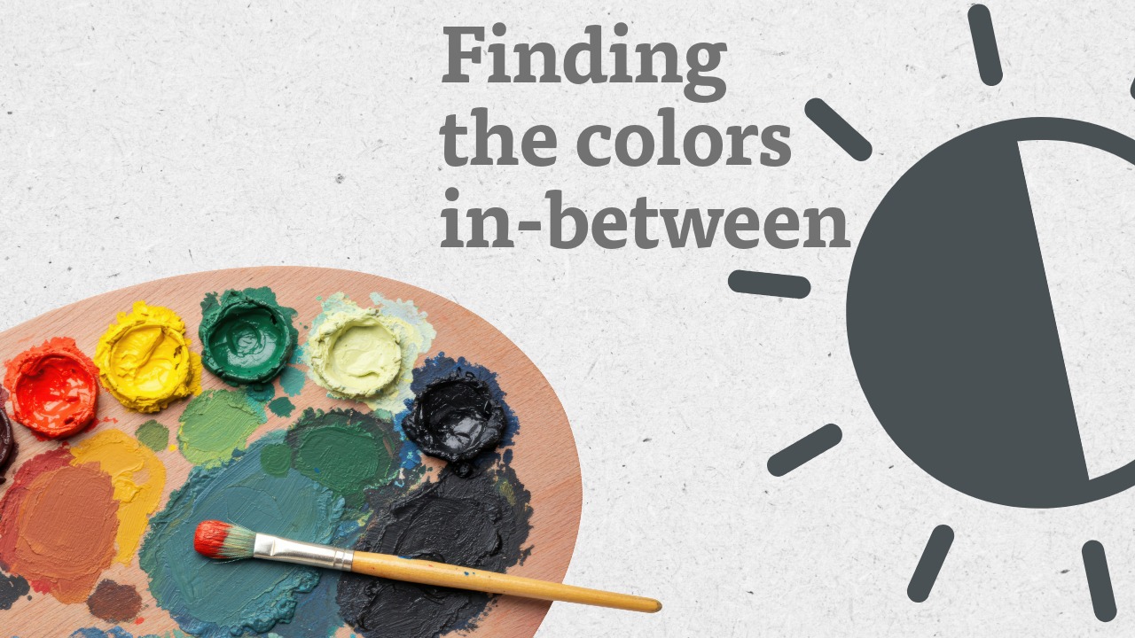
The Secret to Painting Light: Mastering Value and Tone with Nikita Fedosov
What if the secret to capturing brilliant, breathtaking light in a painting had nothing to do with bright white or sunny yellow paint? It’s a thought that challenges a common instinct. For artists and collectors alike, understanding how a master painter truly creates the illusion of light is a revelation. In a recent conversation, Lazare Gallery founders’ son John Wurdeman shared a profound insight from one of his mentors about this very subject, a principle masterfully embodied in the work of the great Russian painter, Nikita Fedosov. It’s a secret that lies not in sharp contrast, but in the closeness of colors.
Key Takeaways
- Light is an Illusion: Artists create the effect of brilliant light not by using pure white paint, but through the skillful relationship between colors on the canvas.
- Value Range is Key: True luminosity comes from working within a compressed range of values (lightness and darkness), similar to the colors found in a slice of bread—from the soft middle to the dark crust.
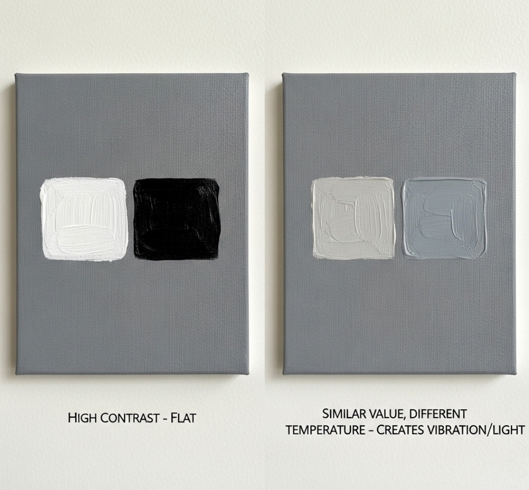
- Color Temperature Creates Vibration: The "shimmer" of light is achieved by placing colors of similar value but different temperatures (e.g., a warm grey next to a cool grey) next to each other. This interplay tricks the eye into seeing light.
The Common Misconception: Chasing the Light with Contrast
Many of us, when we think of light in art, imagine a stark difference between light and shadow, like a bright sun against a dark sky. An artist might instinctively reach for pure white or cadmium yellow to make something look more luminous. The result, however, is often flat and lifeless. It lacks the vibration and atmosphere of real, living light.
This gap in understanding is what separates a good painter from a master. The great artists of the Russian Realist lineage knew that light isn't a pigment you can squeeze from a tube. It is an effect, an illusion created by the masterful relationship between all the colors on the canvas. As John’s mentor, Vyacheslav Zabelin, once explained to him, the common approach is a trap. The real magic happens in a much more subtle space.
 Nikita Fedosov was a master of capturing the subtle, atmospheric qualities of light, as seen in this evocative winter landscape, Plowed Field in the Snow
A Pivotal Lesson: The Bread Analogy
To understand this principle, let’s turn to a wonderfully simple, yet powerful, analogy taught to John by his teacher, Zabelin:
"Light is created by the closeness of values, not the sharpness of contrast," John recalls. "He said the lightest light in the painting will be like the middle of the bread, and the darkest dark will have the tonality of the crust. There’ll never be more contrast than that if you’re actually painting what you see."
Let’s break that down.
- Value: In art, ‘value’ refers to the lightness or darkness of a color. Imagine a black-and-white photograph; you are looking purely at values.
- The Analogy: A slice of bread has a limited range of values. The inside is light, but it’s not pure white. The crust is dark, but it's not pure black. By forcing himself to work within this compressed range, an artist has to find another way to create light.
This is the key. When an artist can no longer rely on the simple trick of extreme contrast, they are forced to use a more sophisticated tool: the relationship between colors. Notice how Zabelin suggests brilliant sunlight without using pure white. The light is created by the relationship between warm and cool tones of similar value.
The Vibration of Light: Color, Tone, and Temperature
So, if not pure white paint, what creates that dazzling sense of light?
The answer is the subtle "vibration" between different colors, specifically their tone and temperature. Instead of creating light with a single bright color, a master like Fedosov creates it in the space between two colors. He might place a warm, slightly orange-toned grey next to a cool, slightly blue-toned grey. Even if their values (their lightness) are very similar, the interplay between the warm and cool temperatures creates a shimmer, a pulse.
Our eyes perceive this energy as light. It’s not just brightness; it’s an energy. It’s the difference between a flatly lit photograph and the way sunlight actually feels as it spills into a room. Fedosov’s masterworks are a perfect testament to this idea. He captures the solemn strength of a winter landscape or the quiet warmth of a rustic interior not by exaggerating light and shadow, but by harmonizing subtle shifts in color and temperature within a narrow value range.
You can see this clearly in his work, ”Like Svetlechnaya”, where he suggests brilliant sunlight without using any pure white paint.
 _Nikita Fedosov was a master of capturing the subtle, atmospheric qualities of light, as seen in this evocative winter landscape, Plowed Field in the Snow_
A Legacy of Light
This profound understanding of light is a cornerstone of the Russian Realist and Impressionist traditions that Lazare Gallery proudly champions. It is a tradition of deep observation and supreme craftsmanship, passed down through generations at institutions like the Surikov Art Institute. Artists like Nikita Fedosov didn't just paint scenes; they painted the atmosphere and the feeling of a moment. Their primary tool for achieving this was a masterful control over light, built on the principle of related values and color temperature.
Understanding this principle enriches our appreciation for their genius. It allows us, as collectors and art lovers, to see beyond the subject and connect with the deeper aesthetic and emotional resonance of the work.
We invite you to explore the timeless works of Nikita Fedosov and other masters of the Russian school in our collection. Discover for yourself the profound beauty and enduring value of paintings that have truly mastered the secret of light.
Frequently Asked Questions (FAQ)
- Q1: What is "value" in painting?
- A1: Value refers to the lightness or darkness of a color, independent of its hue (e.g., red, blue, green). If you took a black-and-white photo of a painting, you would only be seeing the values.
- Q2: Why does using high contrast (pure white and black) often fail to create realistic light?
- A2: High contrast can look stark and artificial. In nature, light is more complex; it reflects off surfaces and is affected by atmosphere, creating subtle shifts in color and temperature. Relying only on contrast ignores these subtleties, resulting in a flat look.
- Q3: Besides Nikita Fedosov, what other artists are known for this technique?
- A3: This principle is a hallmark of many artists in the Russian Realist and Impressionist schools. Look at the works of Isaak Levitan, Valentin Serov, and Aleksei Savrasov to see similar masterful control of light through value and color temperature.
- Q4: What is the difference between tone and value?
- A4: While often used interchangeably, "value" strictly means the lightness or darkness of a color. "Tone" can be a broader term, often referring to a color that has been mixed with grey, or it can describe the overall color atmosphere of a painting (e.g., a "warm tone"). In the context of this article, we focus on value (light/dark) and temperature (warm/cool).